Product Design Case Study
Improving Consultation Continuity
for Solo Clinics
A doctor-first product design case study for reducing missed context, unclear prescriptions, and follow-up gaps in high-volume clinic visits.
This case study explores a lightweight clinical workflow product for Dr. Amit, a solo GP in a Tier 3 city who sees a high number of walk-ins, repeat patients, elderly patients, and emergency cases every day. His current workflow depends on handwritten ledgers, paper files, verbal history, handwritten prescriptions, manual follow-up reminders, and inconsistent records.
The product opportunity was not to digitize everything. It was to design the smallest useful doctor-side system that brings critical patient context into one reliable consultation flow.
Core Design Principles
Doctor-first
Offline-first
Patient-benefit-driven
Simple
Accessible
Clinically contextual
The clinical risk it reduces
History, allergies, current medicines, vitals, and concern appear before diagnosis and prescription.
The workflow burden it removes
Queue selection, consultation notes, prescription, sharing, and follow-up move through one focused doctor-side flow.
The product challenge was to improve the most critical workflow in a solo clinic without introducing a heavy clinic management system. The focus was narrowed to the doctor’s consultation-to-prescription journey because that is where patient safety, speed, continuity, and follow-up reliability converge.
Product Focus
Consultation-to-prescription: Today’s Queue → Patient Snapshot → Consultation Notes → Prescription & Follow-up.
Why this workflow mattered
It connects patient selection, context review, consultation documentation, prescription clarity, emergency handling, follow-up reliability, and offline trust.
Why the product is doctor-side
Patients are not expected to adopt a new product. The doctor uses the system, while patients benefit through clearer prescriptions, saved history, and WhatsApp/SMS/print communication.
The current workflow is fragmented: queue order sits in a ledger, medical context lives in paper files or patient memory, prescriptions are handwritten, and follow-ups are remembered manually later.
Core Product Problem
Critical patient context is not reliably available at the point of consultation — creating safety risk, repeated history-taking, unclear prescriptions, and missed follow-ups.
Key pain points identified
Queue confusion
The handwritten ledger does not clearly show patient order, urgency, or current clinic load.
Emergency visibility
Emergency patients need stronger visual priority, not just another queue entry.
Missing patient context
History, medicines, allergies, and vitals must be visible before consultation.
Consultation capture burden
Long typing is slow, so symptom chips and voice notes support faster capture.
Prescription clarity
Structured prescriptions are clearer than handwritten medicine instructions.
Follow-up reliability
Follow-ups should be set before closing the visit, not remembered later.
Make patient context visible before prescribingShow allergies, medicines, history, visit reason, and vitals before prescribing.
Reduce consultation frictionUse chips, short notes, and optional voice input for faster documentation.
Improve prescription clarityStructure medicine, dosage, duration, food instruction, and advice.
Close follow-up inside the visitSet reminders before the patient leaves.
Make emergency priority visibleUse visual priority, labels, and risk cues for emergency cases.
Work in low-infrastructure settingsSupport offline save and later sync.
Doctor is the primary active app user
Comfortable with smartphone basics, WhatsApp, calls, and UPI, but not a hospital-style system.
Patients should not be forced to install an app
Patients benefit through WhatsApp, SMS, or print without becoming active app users.
Basic check-in may happen before consultation
A helper or doctor may capture patient details, reason, check-in time, and vitals before consultation.
Offline-first is required
Weak internet and power cuts require local save with later sync.
Low-cost mobile/tablet setup is more realistic than desktop infrastructure
A mobile/tablet UI with large tap targets, readable text, minimal typing, and linear flow is more realistic.
Research objective
Understand the clinic rhythm before designing.
The research focused on what breaks during live consultation: missing context, unclear prescriptions, queue pressure, and follow-up gaps.
01What does the doctor need before prescribing?
02Where do patients lose clarity?
03What should stay lightweight?
Research sample
Doctor interviews
Solo GPs and small-clinic doctors.
Patient surveys
Waiting, prescription clarity, and follow-up recall.
Clinic observations
Queue flow, emergencies, repeat history, and admin.
Competitor reviews
Most tools felt appointment-heavy or EMR-heavy, not consultation-first.
Evidence signals
Preferred WhatsApp / SMS over installing a new app
76%
Reported repeating medical history during repeat visits
68%
Found handwritten dosage instructions unclear
71%
Doctors worried about typing during consultation
5 / 8
Follow-up instructions depended on memory or paper
62%
1 core pattern
Support care closure, not just record keeping.
The strongest pattern was continuity loss across queue, history, prescription, and follow-up. This shifted the product toward a focused consultation-to-prescription flow.
How research changed the product direction
INSIGHT 01
Patients prefer familiar channels.
Use WhatsApp, SMS, and print for patient output.
INSIGHT 02
Doctors avoid long forms during consultation.
Use chips, short notes, and optional voice input.
INSIGHT 03
Competitor tools were too appointment-led or EMR-heavy.
Keep the product focused on consultation continuity, not full clinic management.
Research takeaway
Reduce cognitive load at the point of care. Keep the product doctor-side, simple, and useful without forcing patient adoption.
Dr. Amit
Primary user · Doctor
45-year-old solo GP in a Tier 3 city, seeing 40–50 patients/day across walk-ins, follow-ups, elderly patients, and emergencies.
Solo clinicModerate digital comfortHigh patient volumeOffline needs
Goals
- See patients quickly without increasing chaos.
- Access patient history before consultation.
- Avoid missing allergies or current medicines.
- Write clear prescriptions faster.
- Reduce manual end-of-day work.
Pain Points
- Queue confusion from handwritten ledgers.
- Old files may be missing or hard to read.
- Allergies and medicines depend on memory.
- Follow-ups are manually remembered later.
Design Signals
Clinical context before actionCritical
Offline reliabilityCritical
“I need something that helps me during consultation, not another system that creates more work after consultation.”
Patient
Secondary user · Indirect beneficiary
30–60-year-old patient from a Tier 3 city or nearby village; may use SMS, WhatsApp, or printed instructions but may not be comfortable with healthcare apps.
No app expectedLow–moderate digital comfortNeeds clear instructionsFamily support
Goals
- See the doctor without waiting confusion.
- Avoid repeating the same history every visit.
- Receive a clear prescription.
- Remember dosage and follow-up instructions.
- Keep a record for self or family reference.
Pain Points
- Unclear turn order and long waits.
- Lost or damaged paper prescriptions.
- Hard-to-read handwriting.
- Missed follow-up dates.
Design Signals
WhatsApp / SMS comfortMedium
Need for clear instructionsHigh
History recall burdenHigh
“I don’t want to use a new app. I just need clear instructions and for the doctor to remember my history.”
The journey map combines the current clinic reality with the proposed product intervention. Instead of showing before and after as separate sections, it highlights exactly where the product changes the experience for the doctor and the patient.
Doctor journey
| Stage | Before | Product Intervention | After Outcome |
|---|
| Queue | Doctor depends on handwritten register and verbal updates. | Today’s Queue shows waiting count, visit type, and emergency priority. | Faster patient selection with less queue confusion. |
| Patient Context | History, medicines, and vitals are scattered across files or memory. | Patient Snapshot brings current concern, vitals, history, and medicines together. | Context appears before clinical decision-making. |
| Consultation | Notes are manually written and hard to retrieve later. | Symptoms, diagnosis, short notes, and voice input support faster capture. | Lower documentation burden during live consultation. |
| Prescription | Handwritten medicine instructions can be unclear. | Prescription screen structures medicine, dosage, duration, and advice. | Clearer and more consistent patient instructions. |
| Follow-up | Follow-up depends on memory, notebook, or later phone calls. | Follow-up is set before the visit is closed. | Care closure happens inside the consultation flow. |
Patient journey
| Stage | Before | Product Intervention | After Outcome |
|---|
| Arrival | Patient has low clarity on turn order and waiting changes. | Check-in becomes structured with visit reason and basic details. | Less confusion at the start of the visit. |
| Consultation | Repeat patients often explain the same history again. | Doctor sees prior context before starting consultation. | Lower repeat-history burden. |
| Prescription | Patient leaves with handwritten instructions that may be hard to read. | Structured prescription is shared through WhatsApp, SMS, or print. | Instructions are easier to understand and keep. |
| Follow-up | Return date is easy to forget or depends on paper. | Follow-up is captured and shared before the patient leaves. | Lower chance of missed follow-up. |
| Repeat Visit | Previous care context may be missing or hard to access. | Past visit context is available in the doctor-side flow. | Better continuity without forcing patient app adoption. |
Core shift
From scattered paper moments to a connected care flow.
Doctor benefit
Clinical context appears before diagnosis and prescription.
Patient benefit
Clearer instructions without needing to adopt a new app.
Open Today’s Queue
Review total patients, waiting count, and emergency patient pinned at the top.
Tap Patient Card
Open Patient Snapshot and review vitals, history, current medicines, and concern.
Begin Consultation
Confirm symptoms, add diagnosis, and capture doctor notes or voice note.
Create Prescription
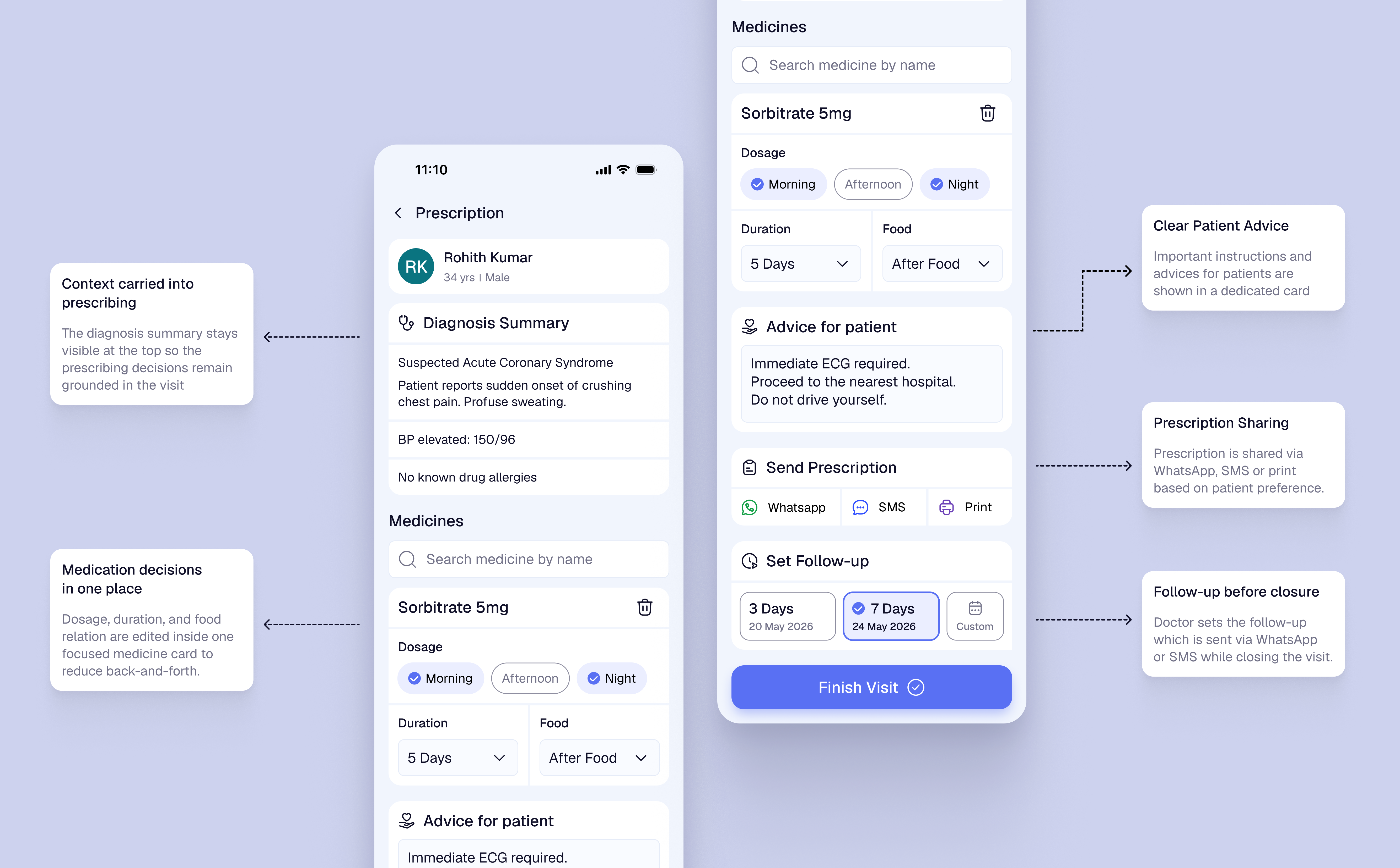
Review diagnosis summary, add medicine details, add patient advice, send prescription, and set follow-up.
Finish Visit
Close the visit after prescription, sharing, and follow-up are handled. Payment is intentionally outside the doctor-side journey.
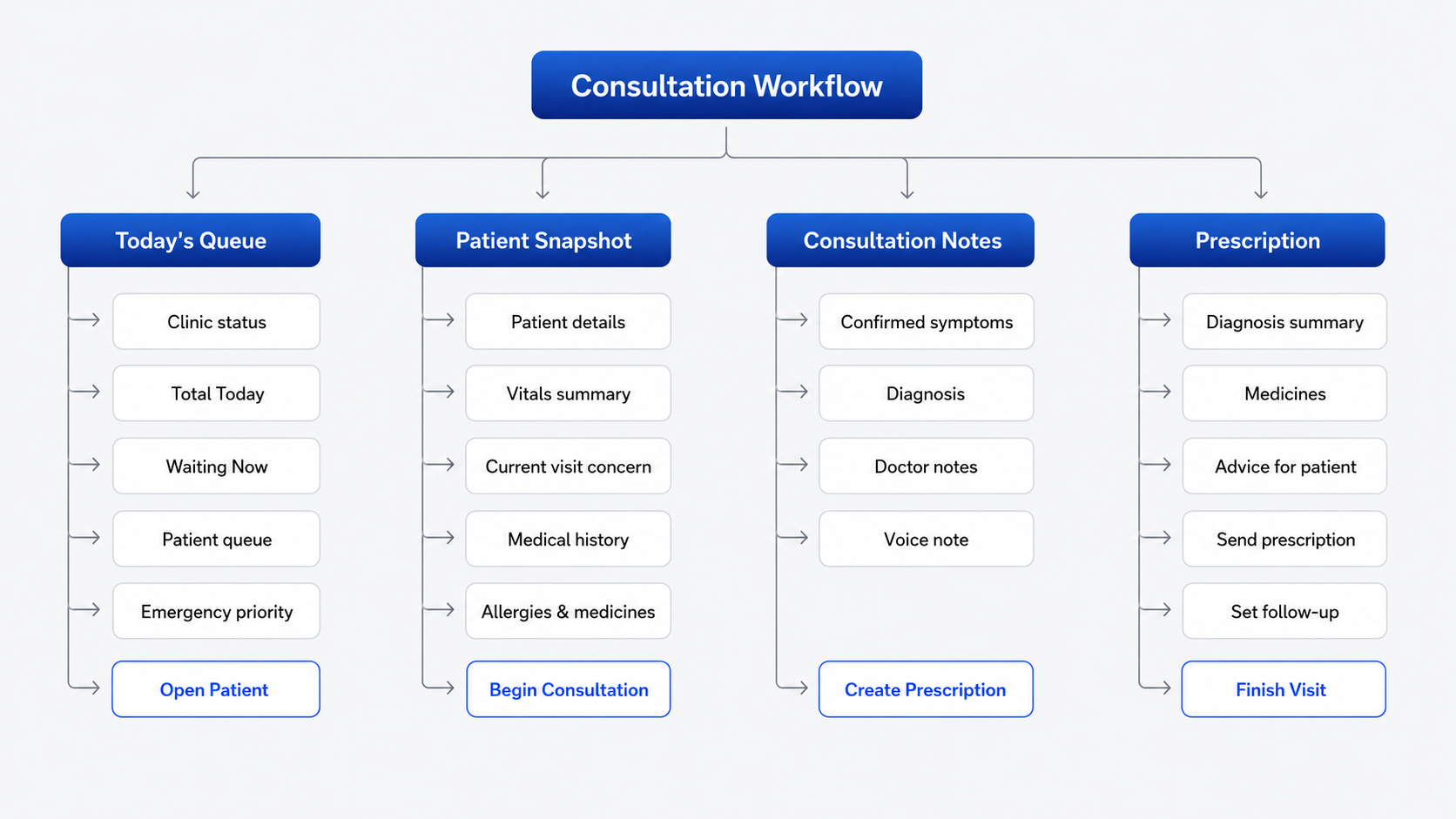
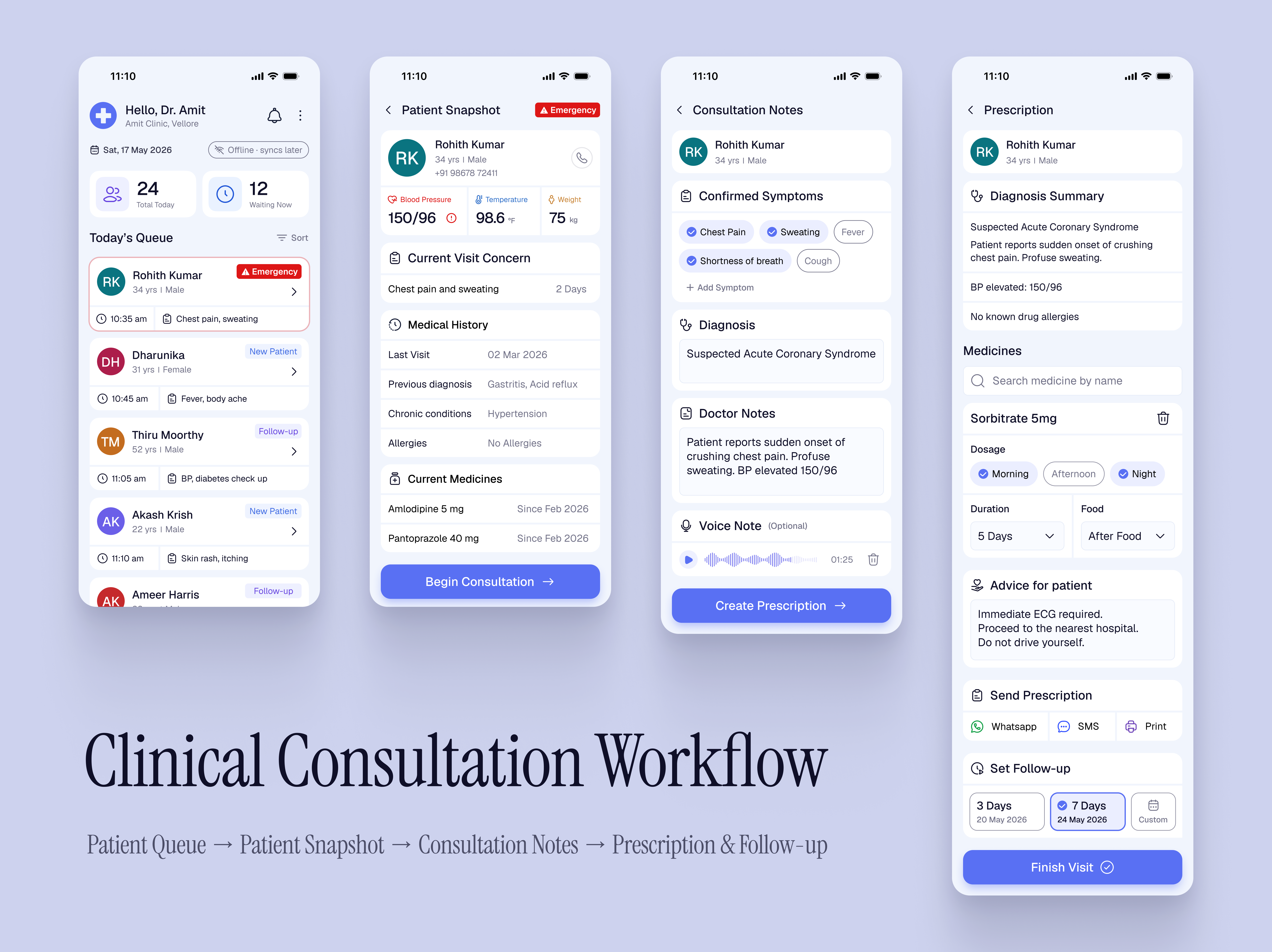
HOLISTIC VIEW — Complete Workflow
A complete view of the end-to-end workflow: Patient Queue → Patient Snapshot → Consultation Notes → Prescription & Follow-up.
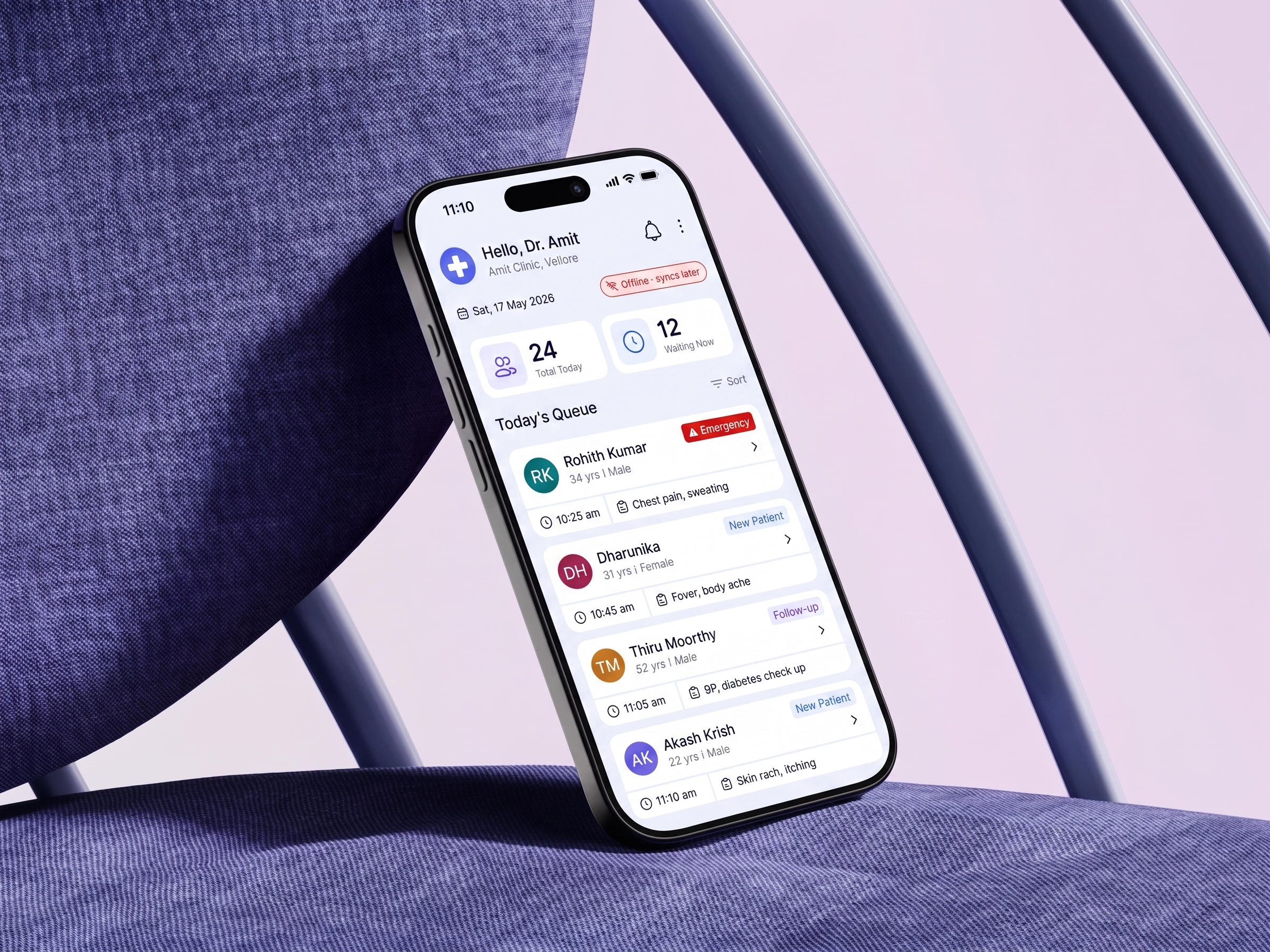
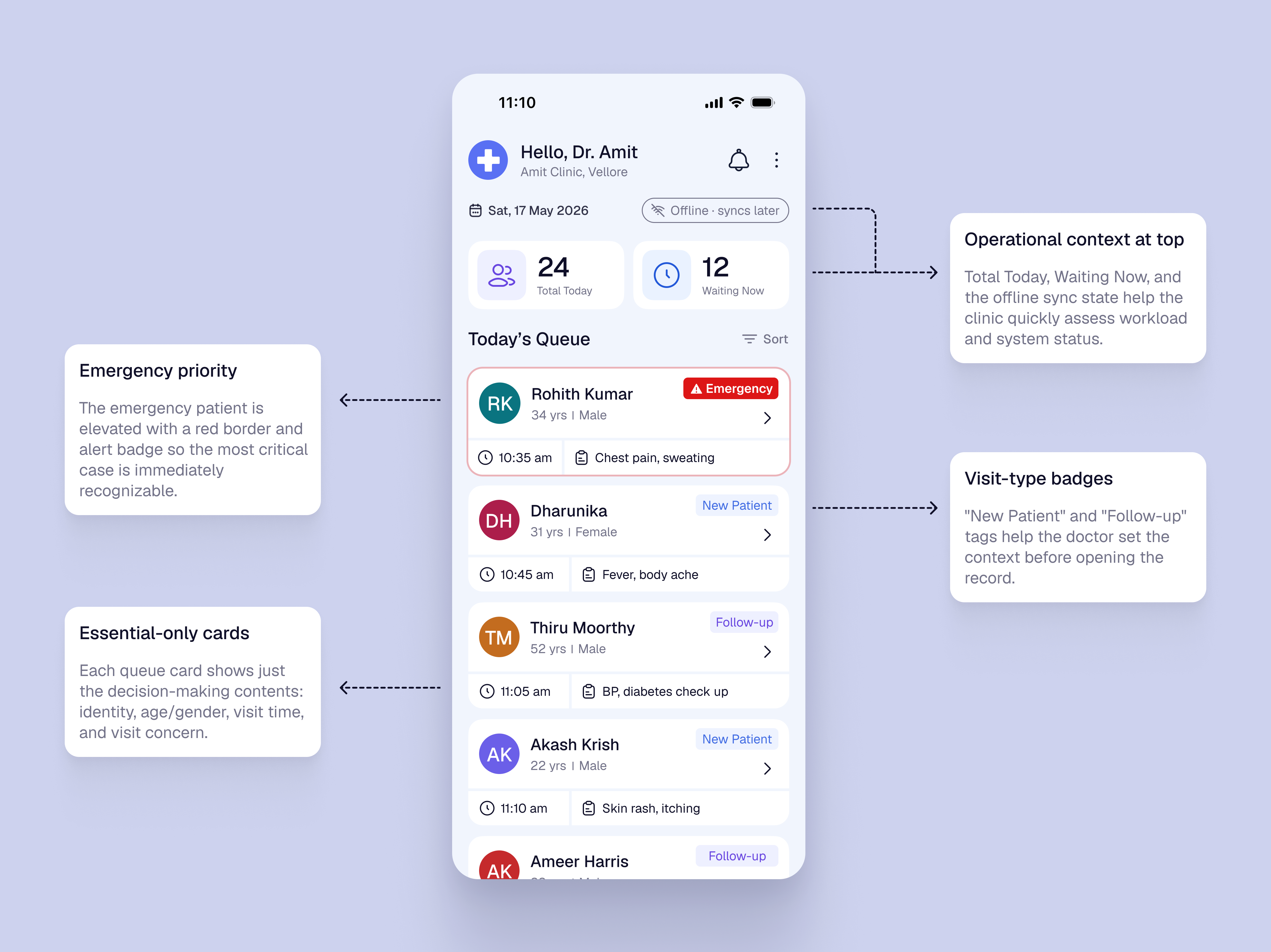
SCREEN 01 — Today’s Queue
The queue screen focuses on workload visibility and patient selection. Emergency priority, visit-type badges, and essential-only cards help Dr. Amit choose the next patient quickly.
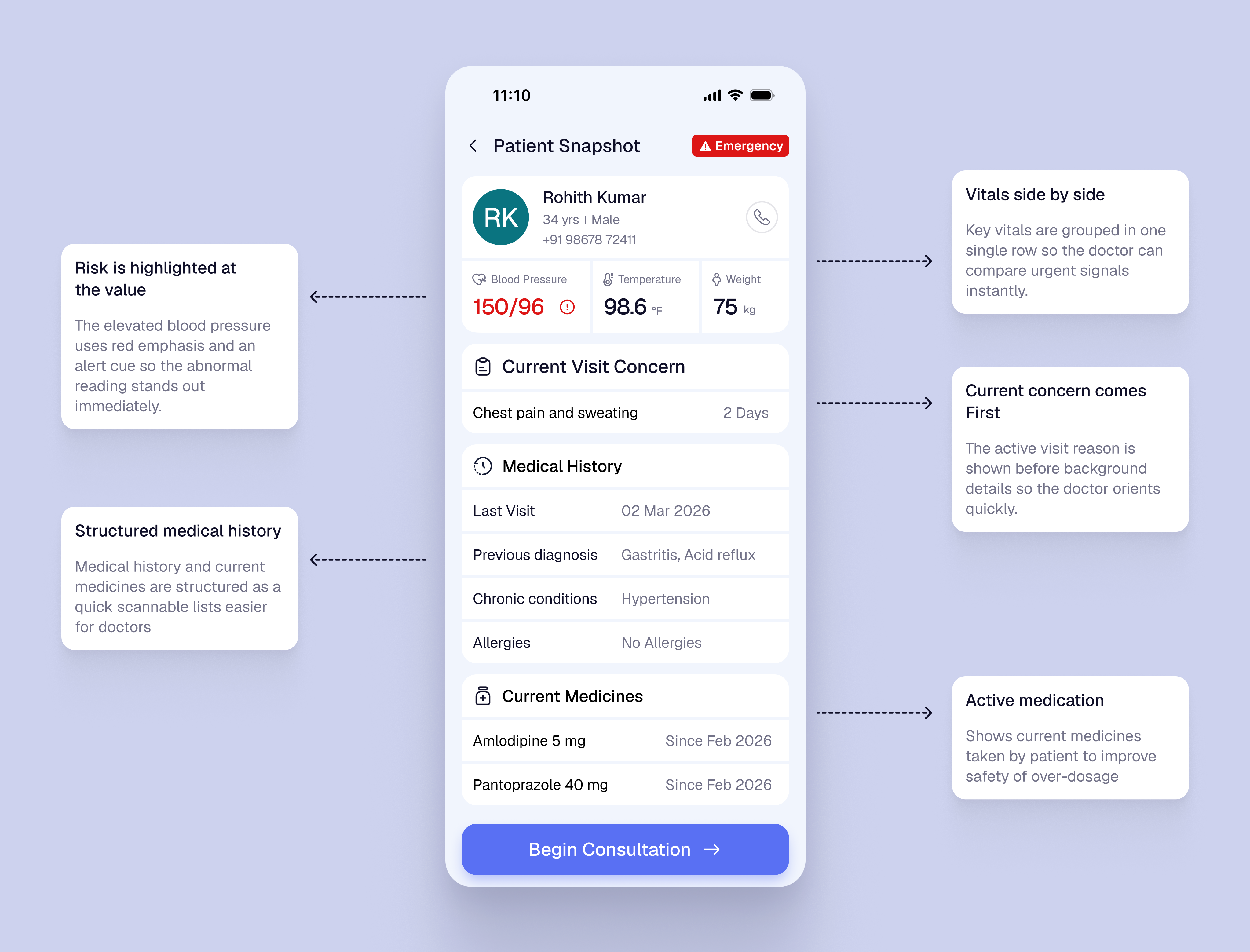
SCREEN 02 — Patient Snapshot
The snapshot screen puts critical context before action. Vitals, current concern, history, and medicines are grouped so Dr. Amit can review clinical context before consultation.
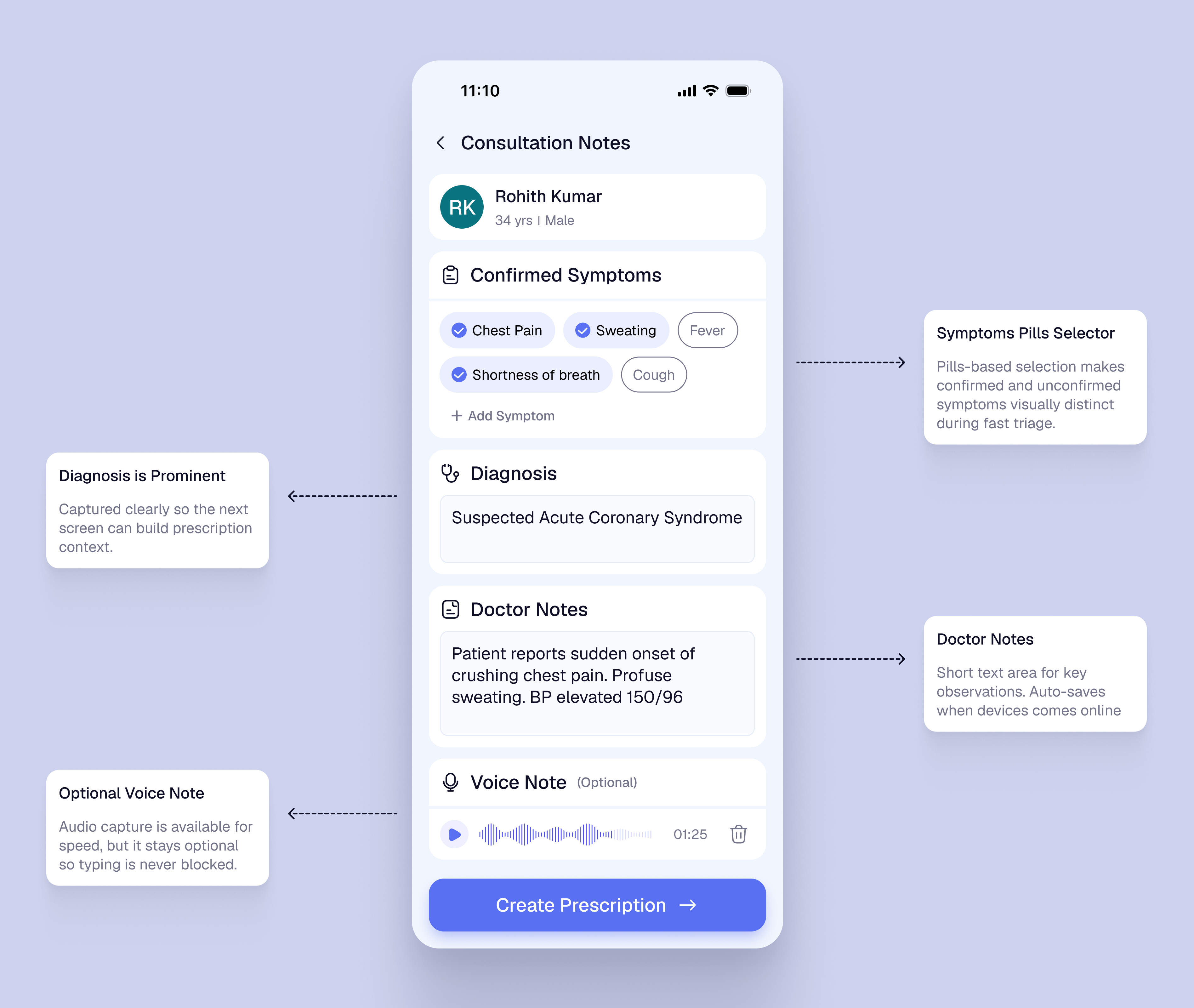
SCREEN 03 — Consultation Notes
The consultation screen stays focused on active documentation: confirmed symptoms, diagnosis, doctor notes, and optional voice note. It avoids repeating full history or queue context.
SCREEN 04 — Prescription
The final screen combines prescription, patient advice, sharing, and follow-up into one care-closure step. Payment stays outside the doctor-side consultation flow.
Key iteration
The first queue concept used a separate “Start Visit” button on each patient card. During review, this felt too action-first and pushed clinical context one step later. I changed the card tap to open Patient Snapshot first, so the doctor sees vitals, medicines, history, and current concern before starting documentation.
Patient card became the CTA
DecisionThe separate Start Visit button was removed. Tapping the patient card opens the Patient Snapshot.
TradeoffThe action is less explicit than a large button, but it reduces duplicate actions and matches natural list behavior.
Emergency priority is visual and explicit
DecisionEmergency cases are pinned first with red border, emergency badge, and clear reason such as chest pain and sweating.
TradeoffIt gives emergency cases stronger visual weight, but avoids making the queue feel like a full triage system.
Clinical context appears before action
DecisionVitals, medicines, history, concern, and abnormal BP warning are shown in Patient Snapshot before consultation begins.
TradeoffThis adds more information upfront, but helps Dr. Amit notice safety-critical context before diagnosis and prescription.
Prescription and follow-up are merged
DecisionPrescription, advice, sharing, and follow-up are handled together in the final screen, while payment is removed from the doctor-side flow.
TradeoffThe final screen becomes denser, but care-closure stays together and the doctor’s flow remains focused on clinical responsibility.
2.5.8 Target Size
Primary actions such as Begin Consultation, Add Medicine, Send, and Finish Visit use large tap areas with spacing, so the doctor can use the app quickly during live consultation.
1.4.1 Use of Color
Emergency and abnormal BP states are not shown through color alone. They use text labels, warning icons, and placement so risk is still clear under stress or poor screen visibility.
3.1.2 Language of Parts
Prescription and follow-up output can support English plus regional templates such as Hindi or Tamil, especially for dosage, food timing, and return instructions.
3.2.3 Consistent Navigation
The product keeps the same linear order across the visit: Queue, Snapshot, Notes, Prescription, Follow-up. This reduces relearning for a doctor using it repeatedly through the day.
WCAG application
The accessibility focus was not only visual compliance. It was making the product usable in a fast, noisy, low-infrastructure clinic, with clear labels, large touch targets, multilingual patient output, and predictable screen order.
3–4h
cumulative daily effort saved
For a 40–50 patient/day clinic, the flow reduces repeated history-taking, manual note-taking, paper prescription effort, follow-up tracking, and end-of-day admin work.
60–70%
expected reduction in missed follow-ups
Estimated impact from setting the follow-up before visit closure, instead of depending on memory, end-of-day calls, or separate manual tracking.
- Faster patient selection from a structured queue.
- Critical context appears before consultation.
- Less documentation friction during visits.
- No app download or login required.
- Clearer prescription through WhatsApp, SMS, or print.
- Follow-up date is easier to remember.
- Queue and records become easier to manage.
- Follow-up is captured before visit closure.
- Offline support fits low-connectivity clinics.
A doctor-side clinical workflow product that improves patient safety, prescription clarity, and follow-up continuity — without forcing patients into a new app or assuming stable clinic infrastructure.